Thursday, 20 September 2012
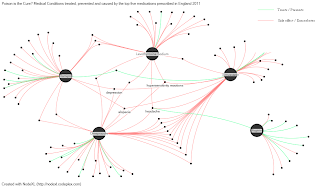
Infographic #3 - an alternative visualisation of Infographic #2
Friday, 14 September 2012
Data viz of the day #2
Its been too long since my last post, and I can only blame a mixture of busyness and lack of inspiration. I think its only a matter of time before you cease to be awestruck by new emergences in a particular field of interest, and I have to confess that I have unknowingly developed a British sense of cynicism towards a lot of new data visualistations I've seen in the last few months. Maybe its saturation, maybe its lack of innovation in the field, who knows. The point is, I finally saw something today which really took my breath away. Its actually a series of visualisations by a Brazilian fellow called Icaro Doria who works for the Portuguese magazine Grande Reportagem. Essentially, Icaro has used data about each country to allocate data points to a coloured element within a flag to illustrate a particular variable, be it country exports or genital mutilation. The facts have been well chosen to really give a fascinating insight into the economic, political, social, and health situations in each country. Anyway, I beg you to take a look, these are phenomenal and such a great example of the power of visualisation to communicate data.
Subscribe to:
Comments (Atom)

