Infographic #3 - an alternative visualisation of Infographic #2
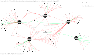
Early on when I was looking at the pharmaceutical data that I used for my first two infographics, I knew I wanted to create some sort of network diagram. I realised early on though that Illustrator wouldn't cut it, and that there was a distinct lack of software that was free, relatively easy to learn, and fit for purpose. Had I have known about NodeXL during that period, the final infographic would have looked very different. In the space of two hours, I created a network diagram! I was so amazed! Its an open-source Excel template created by the Social Media Research Foundation, and it took me no more than about half an hour to work out how to use it. The network diagrams are customisable and you can alter colours, sizes, fonts, layout, and most things. There are a couple of drawbacks of course: I couldn't seem to add a legend (so added this in Paint), and also I couldn't label every vertex otherwise it would have been too crowded (though this is a drawback of network diagrams, not of NodeXL). I do think this infographic does a better job of conveying the inter-connectedness of conditions between the medications, whereas #2 I think shows more the sheer variety of conditions that are possible side-effects. What do you think?


No comments:
Post a Comment